Modernizing an internal security platform for faster, clearer vulnerability tracking
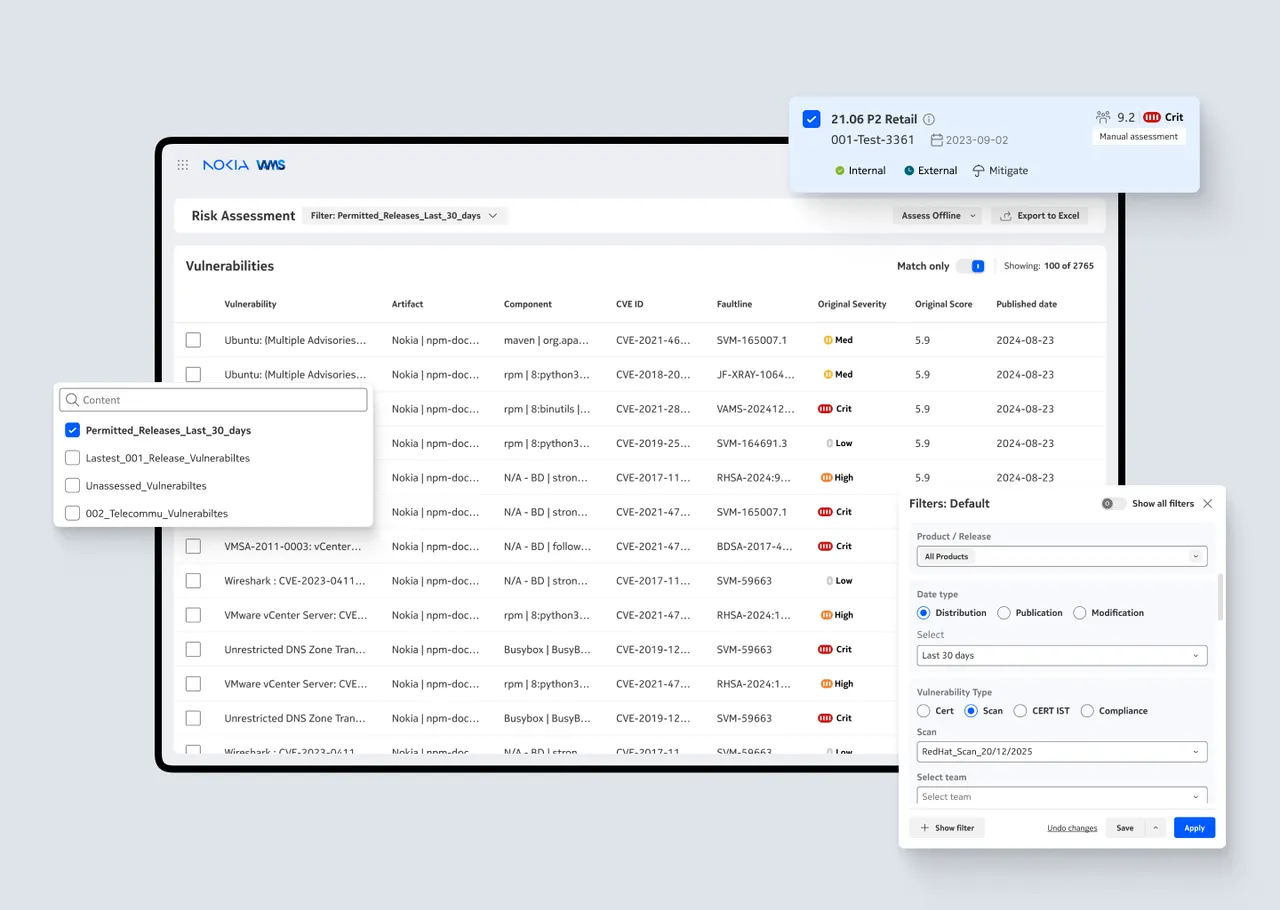
Redesigned Nokia’s risk platform, reducing vulnerability triage time and eliminating workflow gaps to give global teams faster, clearer security assessment.
The existing security risk platform suffered from scattered vulnerability data, low task visibility, inconsistent workflows, and high cognitive load for global teams. Users struggled to track issues end-to-end, understand priorities, and collaborate across regions.
I redesigned the platform by centralizing vulnerability intelligence, creating a unified triage workflow, simplifying navigation, and introducing clear status indicators and role-based dashboards. The solution reduced time spent identifying risks, improved cross-team coordination, and enabled faster, more accurate decision-making across Nokia’s global network teams.
Role:
UX Designer
Team:
6 including Lead Designer, UX Researchers and UX Designers
Problem:
Nokia's mission-critical Search and Risk Assessment (SRA) tool was hindering the very experts it was designed to support, causing significant delays and frustration.
Results:
- 95% drop in time to action
- 2x increase in vulnerability assessment
- 25 reduced decision points
- 4 clicks to assess
Make it discoverable, make it work
The SRA tool was powerful, but it was at war with its users. It was a classic case of a feature rich platform that focused only on function, leading to a state of critical inefficiency. My challenge: make it simple, efficient, and fast — without sacrificing functionality.

Vulnerability Dashboard


The Illusion of Functionality
Core features like search and filtering were so unreliable that users had abandoned them entirely, relying instead on manual, error-prone workarounds.
We simplified the system and added customization—letting users go deeper if they wanted, but never forcing them through irrelevant and mandatory search parameters. Clear progress indicators made the experience feel fast and purposeful.


Filters
A better beginning
The new dashboard turned chores into tasks. By designing for efficiency, simplicity, and ease, we created an experience that users actually enjoyed—and that paid off in faster response times and easier assessments.
